Verde BotanicsSkincare packaging concept
A concept packaging and brand identity for a fictional plant-based skincare line: soft sage tones, a light serif wordmark and one label system across five packs.
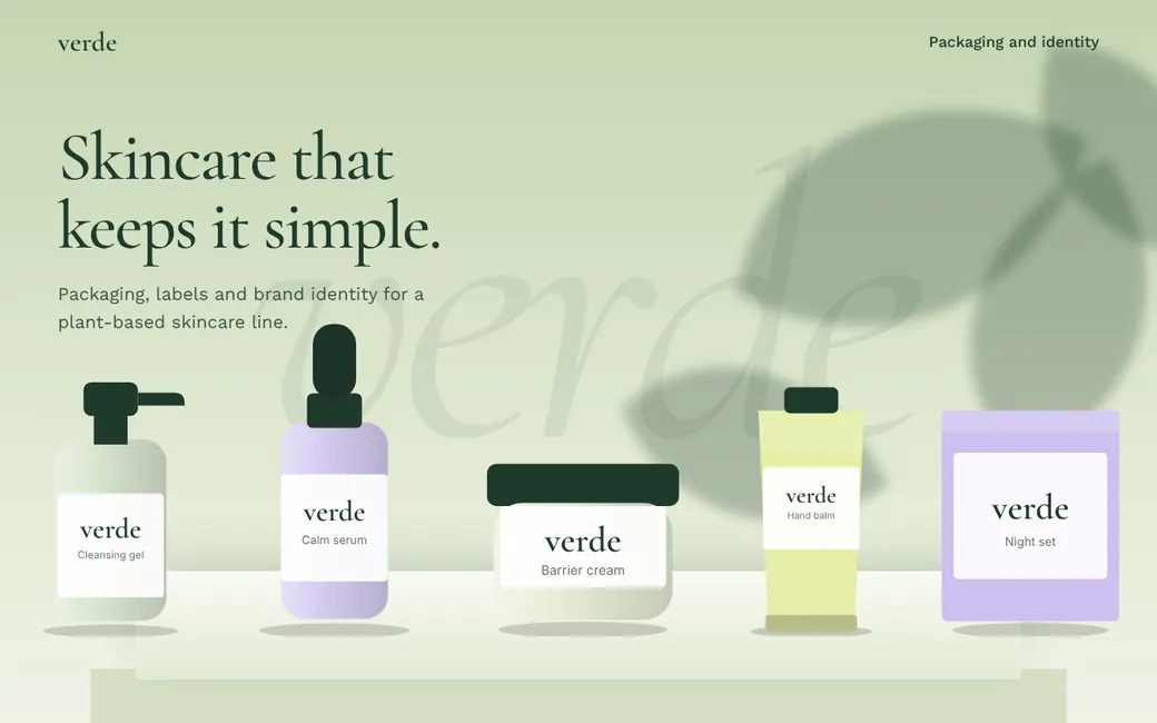
Verde Botanics is an invented brand. We designed it to show how we work, so the names, people, prices and figures on the screens are made up. It is not a client engagement and it comes with no results.
What the concept
set out to do.
Skincare shelves are loud with claims. The brief was the opposite: a range that looks simple, shows each product's job clearly and feels the same across bottle, jar, tube and box.
One system across five packs
A pump bottle, dropper, jar, tube and box share a layout, with the product name and its job in the same place every time.
A light serif wordmark
Thin Cormorant Garamond letters feel gentle on glass and print cleanly on matt paper.
A soft, natural palette
Sage and stone tones with a leaf shadow in the background suggest plants without the usual green clichés.
The whole page,
top to bottom.
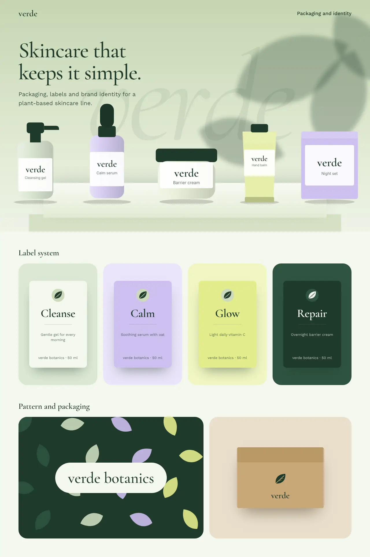
Scroll inside the window to see the whole page.
How we would build
this for you.
Our approach
- Agree the product list, the ingredients and the claims you are allowed to make.
- Design the label system first, then adapt it to each pack shape.
- Prepare print-ready artwork with dielines, bleed and colour profiles for your printer.
- Create matching web and social assets so the online shop looks like the shelf.
What you would get
- Wordmark
- Label system
- Five pack designs
- Print-ready artwork
- Shop and social assets
More concept
projects.
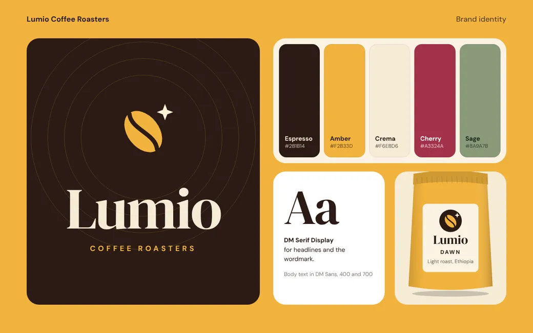
Lumio Coffee Roasters
Concept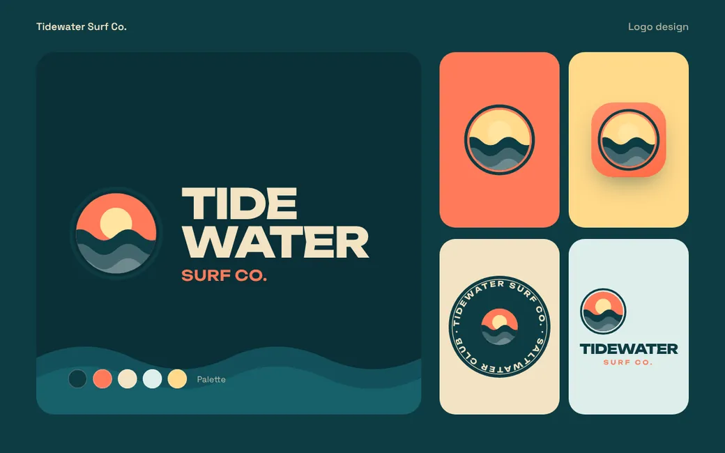
Tidewater Surf Co.
Concept
Pocketplate
Concept