Tidewater Surf Co.Logo design concept
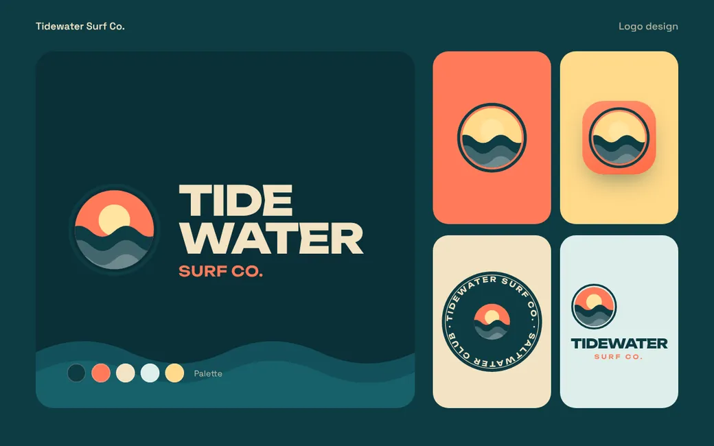
A concept logo design for a fictional surf company: a wave-and-sun mark, a stacked wordmark and a badge for merchandise.
Tidewater Surf Co. is an invented brand. We designed it to show how we work, so the names, people, prices and figures on the screens are made up. It is not a client engagement and it comes with no results.
What the concept
set out to do.
Surf brands live on stickers, boards and clothing, so the logo has to hold up at tiny sizes and in two colours. The brief was one mark with several useful versions.
One mark, several lockups
A stacked wordmark, a round badge, a square app icon and the mark on its own, each with clear-space rules.
Colour for dark and light
A deep teal base with orange, yellow and cream accents gives enough contrast for printing on both dark and light products.
Built for merchandise
The round badge is drawn with fewer details and thicker lines, so it suits embroidery and screen printing.
The whole page,
top to bottom.
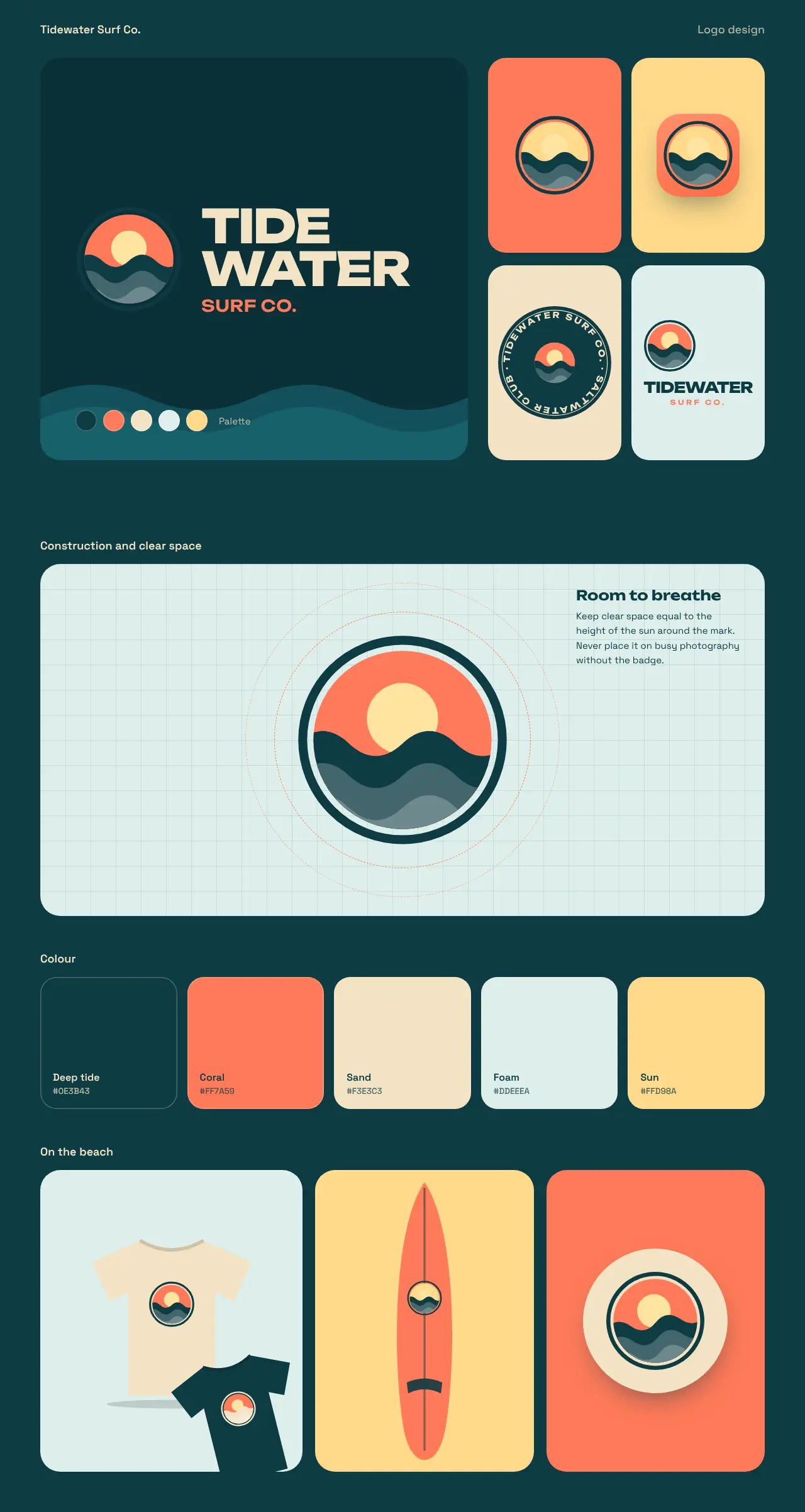
Scroll inside the window to see the whole page.
How we would build
this for you.
Our approach
- Collect references and agree a direction before anything is drawn.
- Sketch widely, then build the chosen route as clean vector artwork.
- Test the logo at favicon size, on dark backgrounds and in a single colour.
- Deliver SVG, PNG and PDF files with a one-page usage guide.
What you would get
- Primary logo
- Badge and icon versions
- Colour palette
- Single-colour versions
- Usage guide
More concept
projects.
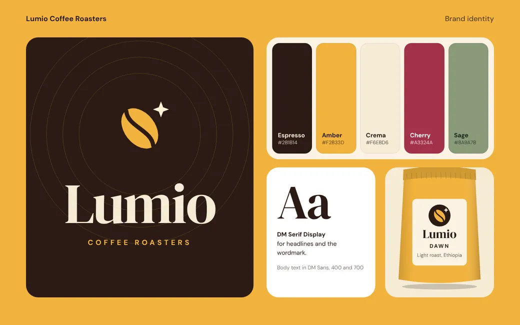
Lumio Coffee Roasters
Concept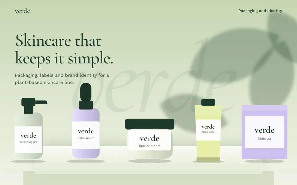
Verde Botanics
Concept
Stridewell
Concept